Hey there!
Are you tired of spending hours debugging your React app, only to realize that a small tweak in your UI component threw everything off? Do you wish there was a way to isolate and test your components in a more efficient way?
Well, wish no more! Today, I want to introduce you to an amazing tool that has revolutionized the way I develop React apps: Storybook.
What is Storybook?
Storybook is an open-source tool that allows you to develop and test your React components in isolation. It creates an interactive environment where you can play around with your components, tweaking props and styles to see how they behave in different scenarios.
How does it work?
Getting started with Storybook is a breeze. You simply install it using npm or yarn, and then write stories for each of your components. A story is essentially a scenario that showcases your component in a specific state or with certain props.
For example, let’s say you have a Button component, and you want to test how it looks with different text colors. You
would write a story for your Button component, specifying the different text color props you want to test.
Storybook then generates a UI that allows you to interact with your component in real-time, without having to set up a full-fledged app or navigate through a cumbersome debugging process.
The Benefits
So, why should you care about Storybook? Here are just a few benefits that I’ve experienced firsthand:
Better Component Isolation: Storybook lets me focus on individual components without worrying about how they’ll interact
with the rest of the app.
Improved Collaboration: Storybook makes it easy to share components with my team and stakeholders, so we can all be on
the same page.
Need help to get the results?
Getting Started
Ready to give Storybook a try? Here’s a simple recipe to get you started:
- Run
npx sb initto set up a new Storybook project. - Write your first story by creating a new file in the
storiesdirectory. - Start Storybook with
npm run storybookand start playing with your components!
How to write stories and docs for components?
To make the most of Storybook, you’ll need to write stories and documentation for your components. Here’s how you can do it.
Writing Stories
Let’s create a Button.stories.tsx file:
import { Meta, StoryObj } from '@storybook/react';
import { Button, ButtonProps } from './Button';
import React from 'react';

const meta: Meta<ButtonProps> = {
  component: Button,
  title: 'Components / Button',
  parameters: {
    controls: {
      // add needed props to control
      include: ['size'],
    },
},
// describe the props
argTypes: {
  size: {
  control: { type: 'select' },
  options: ['small', 'medium', 'large'],

  // table is rendered in the controls panel
  table: {
    defaultValue: { summary: 'medium' },
    type: { summary: 'small | medium | large' },

  },
  },
},

// default props passed to stories

args: {
  children: 'Click me',
}
};

export default meta;

type Story = StoryObj<ButtonProps>;

export const Large: Story = {
  args: {
    size: 'large',
  }
};

export const Secondary: Story = {
  args: {
    color: 'secondary',
  },
};

export const CounterExample: Story = {
  render: (args) => {
	const [count, setCount] = React.useState(0);

	return (
	  <React.Fragment>
  	    <p>{count}</p>

	    <Button {...args} onClick={() => setCount((prev) => prev + 1)}>
	      Increment
	    </Button>
	  </React.Fragment>
	);
},

};
Writing Documentation
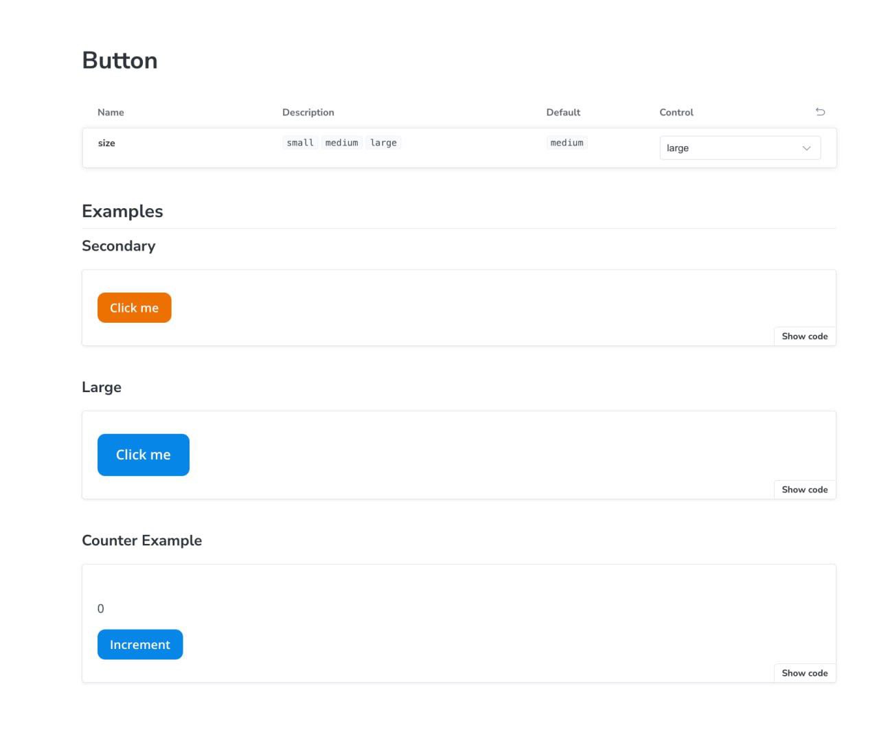
To write documentation, create a Button.mdx file:
import { Canvas, Meta, Controls } from '@storybook/blocks';
import * as ButtonStories from './Button.stories';

<Meta of={ButtonStories} name="Docs" />

# Button

{/* table with controls */}
<Controls />

## Examples

### Secondary

<Canvas of={ButtonStories.Secondary} />

### Large

<Canvas of={ButtonStories.Large} />

### Counter Example

<Canvas of={ButtonStories.CounterExample} />
and that’s it:

Conclusion
Storybook has been a game-changer for my React development workflow, and I’m confident it will do the same for you. Give it a try today and start building faster, more reliable, and more maintainable React components!
