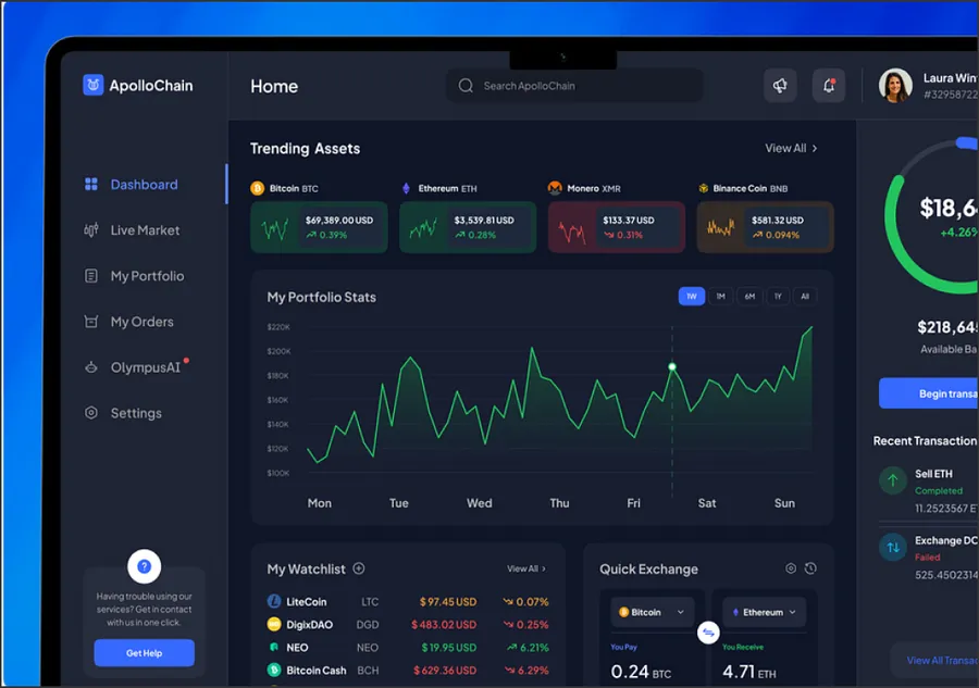
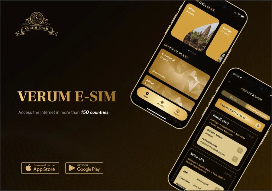
A Figma file becomes good code when the file is built for it. Most of the delay in Figma to code projects comes from missing states, loose spacing and components that exist only as pictures, not from the coding itself. Below: what a handoff needs, which output suits your stack, and how we check the result.
What does a Figma file need before it can be built?
We review the file before we quote. A file is ready when it has:
- Tokens: colors, type styles, spacing and radii defined as Figma variables or styles, not picked ad hoc on each frame.
- Components with variants: buttons, inputs and cards built as components, with hover, focus, disabled and error states drawn.
- Auto layout: frames that resize by rule, so we can read the intended behavior instead of guessing it.
- Responsive rules: at least a mobile and a desktop frame per template, plus a note on what happens between them.
- Real content: realistic headlines and lengths, because “Lorem ipsum” hides the wrapping problems.
Missing pieces are normal. We list them in a short gap report and either ask your designer to fill them or propose a default you approve.
Which output do you need?
The right output depends on who will maintain the code.
| Output | Fits | Trade-off |
|---|---|---|
| Static HTML and CSS | Landing pages, email-adjacent pages, a prototype for a backend team | No component reuse; every change is a manual edit |
| React components | Product UIs and apps with state | Needs a React team to own it |
| Astro components | Content-heavy marketing sites that must be fast | Interactive parts are added as islands |
| CMS-ready blocks | Sites where editors compose pages | Needs a block model agreed with the design |
If the site needs a content model, the blocks map to CMS content types. That is the route we take for teams on a headless CMS, where each Figma section becomes a block an editor can reuse. For fast marketing sites we usually pick Astro, and for app screens React.
How do we turn a design into components?
We read the Figma component tree first and keep names aligned: a component called Card/Feature in Figma becomes a FeatureCard in code with the same variants as props. Tokens are exported once and compiled to CSS custom properties, so a color change in design reaches the code through the token file and not through a search and replace.
Layout follows Auto layout rules where they exist. Where they do not, we agree on breakpoints with your designer and write the rules down, so the next page is built the same way.
How do we check the build against the design?
Pixel-perfect is a useful phrase and a poor test. We test three things:
- Visual match at the breakpoints in the file, with screenshots laid over the Figma frames and every deviation recorded.
- States and behavior: focus order, keyboard use, hover and error states, tested by hand.
- Quality checks: semantic HTML, image sizes and Lighthouse scores, measured before handoff.
Accessibility is part of this list. Contrast, labels and focus visibility are checked against WCAG 2.1 AA, and anything the design makes impossible is reported to your designer with a suggested fix.
When is Figma to code part of a bigger job?
A single landing page is a contained project. A product with dozens of screens is a design system problem, because the same button will be coded many times unless there is a shared library. In that case we build the component library first, with Storybook documentation, and then compose screens from it. That route is described on our design system agency page.
What do we deliver?
- A gap report on the Figma file, with questions for your designer.
- Code in your repository as pull requests, with a README on structure and naming.
- Tokens exported from Figma into the codebase.
- A comparison of the build against each frame at the agreed breakpoints.
- A short handover call for your engineers.
Cost depends on the number of unique templates and components, the output you pick and how complete the file is. We scope it after reviewing the file.