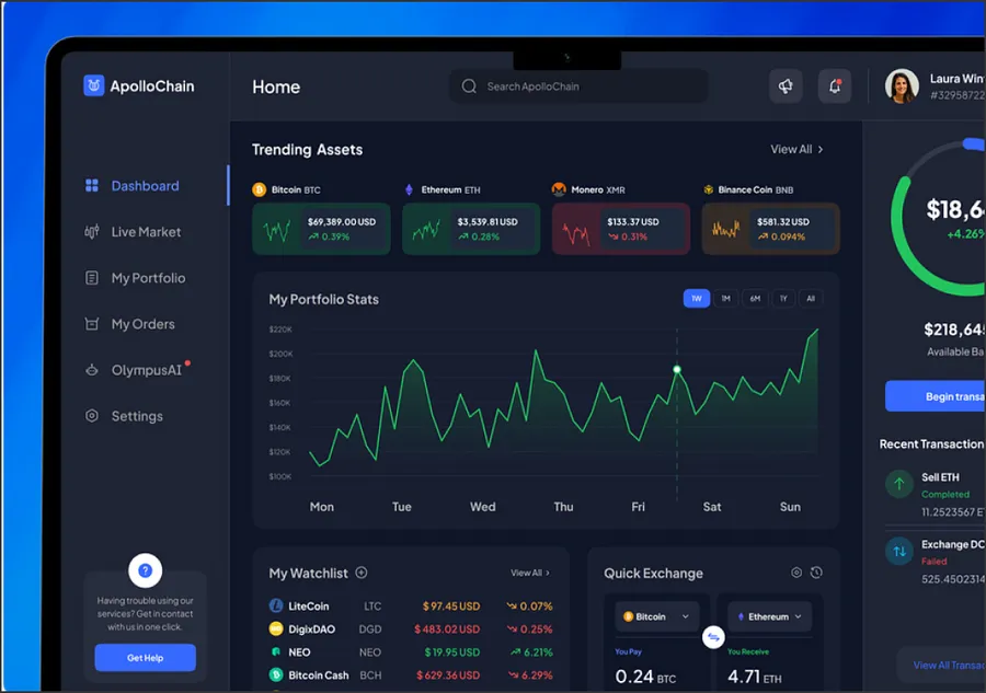
If you are asking whether shadcn/ui can carry a product UI, the answer is yes, with one condition: someone has to own the code. shadcn/ui is not a package you install and upgrade. It is a set of component sources that a command copies into your repository, so every button, dialog and data table becomes your code from day one. We build with it as the base for product UIs and for shared component libraries, and we hand over a codebase your team can read and change.
What does shadcn/ui actually give you?
The CLI reads a components.json file and writes component files into your project. Each file composes an accessible primitive with Tailwind classes and a small variant helper. There is no runtime dependency on a vendor library for styling and no theme provider to fight.
That model has a clear trade. You can change markup, add a prop or fix a bug without waiting for a release. You also take on maintenance, because nobody pushes updates into your files. Teams that review upstream changes on purpose do well. Teams that copy forty components and never look again end up with a pile.
Radix or Base UI: which primitives sit underneath?
The primitive layer handles focus, keyboard navigation and ARIA, which is the part most teams get wrong when they write dialogs and menus by hand. shadcn/ui has long been built on Radix UI, and the project now also lets you pick Base UI as the primitive set.
We choose per project:
| Question | Pick Radix | Pick Base UI |
|---|---|---|
| Do you want the most documented, most widely used option? | Yes | Not a priority |
| Are you starting a new library with no legacy? | Either works | Worth a look |
| Do you already have Radix code in production? | Stay on it | Migrate only with a reason |
We keep the choice behind your own component API, so a later switch does not touch product screens.
How do Tailwind v4 tokens and theming fit in?
Theming in shadcn/ui runs on CSS variables. With Tailwind v4 those variables are exposed through @theme, so a color or radius is defined once and available both as a utility class and as a plain CSS custom property. We set up three layers:
- Raw values: the palette, type scale and spacing, defined once.
- Semantic tokens:
background,foreground,primary,border, named by role and not by color. - Component tokens: only where a component truly needs its own value.
Components read semantic tokens only. A rebrand then means editing the token file, and a second brand or a white-label tenant means a second set of values. If you are moving an older Tailwind setup, our Tailwind CSS development page covers the migration side.
When does shadcn/ui turn into a design system?
A folder of copied components is a starter kit. It becomes a design system when other teams depend on it and it keeps its shape as they do. That needs four things on top of the components:
- A versioned package or registry, so product teams install and update the library on a schedule.
- Documentation in Storybook, with every variant and state as a story and accessibility notes beside it.
- Visual regression and accessibility checks in CI, so a change that shifts a button on twelve screens is caught before merge.
- Contribution rules: who can add a component, how a variant is proposed, how a breaking change is announced.
This is the work our design system agency team does on top of the shadcn base. If you are weighing it against a packaged library, read shadcn vs MUI first.
When should you not use shadcn/ui?
It is a poor fit when:
- you need a finished, supported component suite with a vendor to call, and no frontend engineers who want to own UI code;
- the product is not React;
- you need heavy data grids or schedulers, where a specialist library saves months.
In those cases we say so in the first call and suggest the alternative.
What do we build with shadcn/ui?
- Product UIs and admin panels in Next.js or Vite.
- Shared libraries for several product teams, published as a package.
- Re-skins of existing apps onto a token layer, one screen at a time.
If you want to add engineers to an existing team, see our shadcn developers for hire.
Proof: a shared library for eight teams
A European Series-B fintech had eight product teams and three incompatible button styles. We built a shadcn and Radix library with a token layer and Storybook documentation, and shipped it to all eight teams. The case study reports ~60% less duplicated UI component code, 8 weeks from audit to all eight teams on the shared library, and ~3x faster cross-team design token changes. Read it in full: component library for a European fintech platform.
How we work
We start with a short audit of your components and repositories, agree the token schema with design and engineering leads, then build in batches so teams can migrate the busiest screens first. Work lands as pull requests in your repository. Cost depends on component count, the number of consuming teams and how much code has to migrate, and it is scoped after the audit. Our hourly band is $50 to $150 per hour for embedded engineers.